
Before


VISUAL IDENTITY . LOGO . SOCIAL GRAPHICS . PRINT MATERIAL . BRANDED MERCH
Client:
Integrity Site Development is a family-run excavation and septic services company committed to honesty, transparency, and high-quality work. With over 15 years of experience, they serve Worcester County with reliable site development, septic installs, and full lot preparation.
Challenge:
Integrity Site Development needed a visual identity that captured the heart of their mission: doing every job with honesty, clarity, and high-quality workmanship. Their growing service offerings and expanding client base required a brand that felt both rugged and refined; something that would stand strong across trucks, heavy machinery, and digital platforms. They came to us to unify their look, elevate their presence, and position themselves as a trusted leader in their industry.
Before



Our Role:
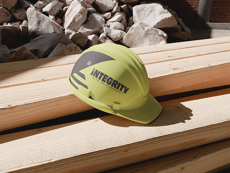
Awen & Co partnered with ISD to build a complete brand identity system from the ground up. We developed their logo suite, business cards, vehicle wraps, machine branding, merch, hats, letterhead, social templates, and a custom website. Every deliverable was crafted to reflect their values of integrity, communication, and exceptional quality.
Approach:
We began with an in-depth discovery process to understand ISD's story, differentiators, and long-term vision, including their future plan to expand into general contracting. From there, we designed a cohesive brand system that balanced construction grit with a polished, trustworthy aesthetic. Our goal was to ensure every touchpoint, from a septic truck on the road to their website, communicated clarity, professionalism, and transparency.
Creative Direction:
The creative direction draws from the strength and reliability of the excavation industry, blending bold typography with clean lines and a striking, high-visibility color palette. We created a mark that speaks to movement, precision, and land-shaping, key themes in ISD's work. The final identity feels modern, rugged, and unmistakably rooted in their core value: integrity.
outcome:
The refreshed brand positions Integrity Site Development as a standout leader in their market, giving them the confidence and consistency to grow with purpose. Their new identity shines across trucks, equipment, apparel, print collateral, and digital platforms, creating instant recognition and trust. The result is a brand built to scale: strong enough for the field, polished enough for the industry, and authentic to the family behind it.


"Do we have a quote from them?"
quote will go here
— Names, position

