How We Craft Purposeful Brand Palettes for Standout Brands
Color is one of the first things people will notice about your brand. The colors used in your visual brand identity influence how people feel about your business, how well you’re recognized and remembered, and whether or not potential customers choose to book or buy.
That's why, when it comes to choosing your brand colors, we go for purposeful over pretty.
In this post, we’re taking you behind the scenes to show all of the strategy that goes into crafting your brand palette. Once you see all of the factors that go into every hue, you’ll understand why we didn’t just let you pick your favorite colors to represent your brand.
Color Psychology
Color theory is all about how to combine colors to create visual harmony.
One aspect of color theory that plays a big role in the work we do as brand designers is color psychology.
Colors can evoke specific emotional responses. Because of this, color becomes a powerful tool for influencing brand perception and buyer behavior. According to one study, 85% of buyers cited color as the main factor in their product selection.
When we develop your brand palette, we think about the answers to these questions as we determine which colors will best connect with your audience, reinforce brand awareness, and fit your brand personality:
What adjectives would you use to describe your brand's personality?
What are the norms for your industry?
Do you want to fit industry norms or intentionally disrupt them?
Who is your ideal customer?
How do you want your ideal customer to feel when they interact with your brand?
What colors do your competitors use?
From there, we put on our "Color Theory Hats" and consider the typical feelings evoked by different hues. We keep in mind that these associations can vary from culture to culture, which matters even more for global brands. For instance, in the United States, red elicits feelings of hunger, urgency, and excitement. However, in China, red symbolizes luck and joy, and in parts of South Africa, it's the color of grieving.
It’s also important to be aware of the potential “negative associations” that each color can have and address those concerns with a thoughtfully balanced palette. Choosing the right tone for your brand’s vibe can also go a long way in overcoming these possible challenges. For instance, selecting a more muted orange for your adult yoga studio can signal positivity without coming across as too childish and playful.
Here is a basic overview of common color associations:

Red
Power, Energy, Hunger, Love, Strength, Desire
>Potential risks: Can be associated with danger and anger.
Orange
Motivation, Positivity, Confidence, Playfulness, Enthusiasm
>Potential risks: Can be perceived as too youthful or showy.
Yellow
Optimism, Warmth, Joy, Inspiration, Happiness
>Potential risks: Can be associated with caution and fear.
Green
Balance, Growth, Wealth, Health, Peace, Harmony
>Potential risks: Can be associated with materialism and greenwashing.
Blue
Trust, Dependability, Responsibility, Calm, Relaxation
>Potential risks: Can be perceived as sad or predictable.
Purple
Creativity, Magic, Spirituality, Luxury, Courage, Mystery
>Potential risks: Can be perceived as too emotional or unconventional.
Pink
Femininity, Sophistication, Romance, Intuition, Gratitude
>Potential risks: Can be perceived as frivolous or juvenile.
Brown
Stability, Reliability, Tradition, Honesty, Comfort
>Potential risks: Can be perceived as boring or timid.
Black
Boldness, Elegance, Seriousness, Sexiness, Power
>Potential risks: Can be associated with sadness or dominance.
White
Purity, Innocence, Simplicity, Perfection, Cleanliness
>Potential risks: Can be perceived as cold, empty, or dull.
Practical Considerations
Beyond the psychological impact of your brand colors, we also consider how you will use your visual branding.
Thinking ahead helps avoid headaches down the line and ensures that you walk away with impactful brand colors that you can use consistently.
How You’ll Use Your Colors
Imagine you are an outdoor brand with equipment, vans, and uniforms that will primarily appear in natural sunlight. That may influence choices about color brightness and saturation.
Or, let's say you plan to produce branded apparel on a large scale. If that's the case, we want to ensure your palette includes some colors with broad appeal, knowing we can always use pops of less conventional colors to reinforce your branding. We also want to be mindful of whether fabric and thread will be easily available in your colors.
How to Position Yourself
Did you know that 38% of Fortune 500 companies have primarily blue logos? It makes sense when you think of blue’s associations with stability, safety, and trust. So when TD Bank chose to go a different direction with a green logo that stands for wealth and growth, it stood out from the sea of blue.
While you may not want to go so directly against industry norms, we still want your brand palette to stand out from your primary competitors. Color improves brand recognition by up to 80%, making it a powerful way to reinforce positioning and foster brand awareness.
If you sell products in retail environments, this can be especially important. You want to stand out on a shelf so you're the brand people remember and reach for!
Legibility and Accessibility
Contrast is key to ensure people can see and read your branding comfortably. There are also accessibility requirements that penalize websites that don't have appropriate on-screen contrast, ensuring all readers can access the site.
What a Purposeful Palette that Reflects Your Brand’s Personality Looks Like
After this process of strategic thinking and artful exploration, you’ll end up with a brand palette that means something and serves you well.
Your Brand Book will include a complete Palette Report with all color types (Pantone, CMYK, RGB, HEX) for each of your brand colors. It will also indicate your primary colors, neutrals, and accent colors, along with directions on how to pair them to ensure appropriate contrast.
Here’s an example from a recent branding project:

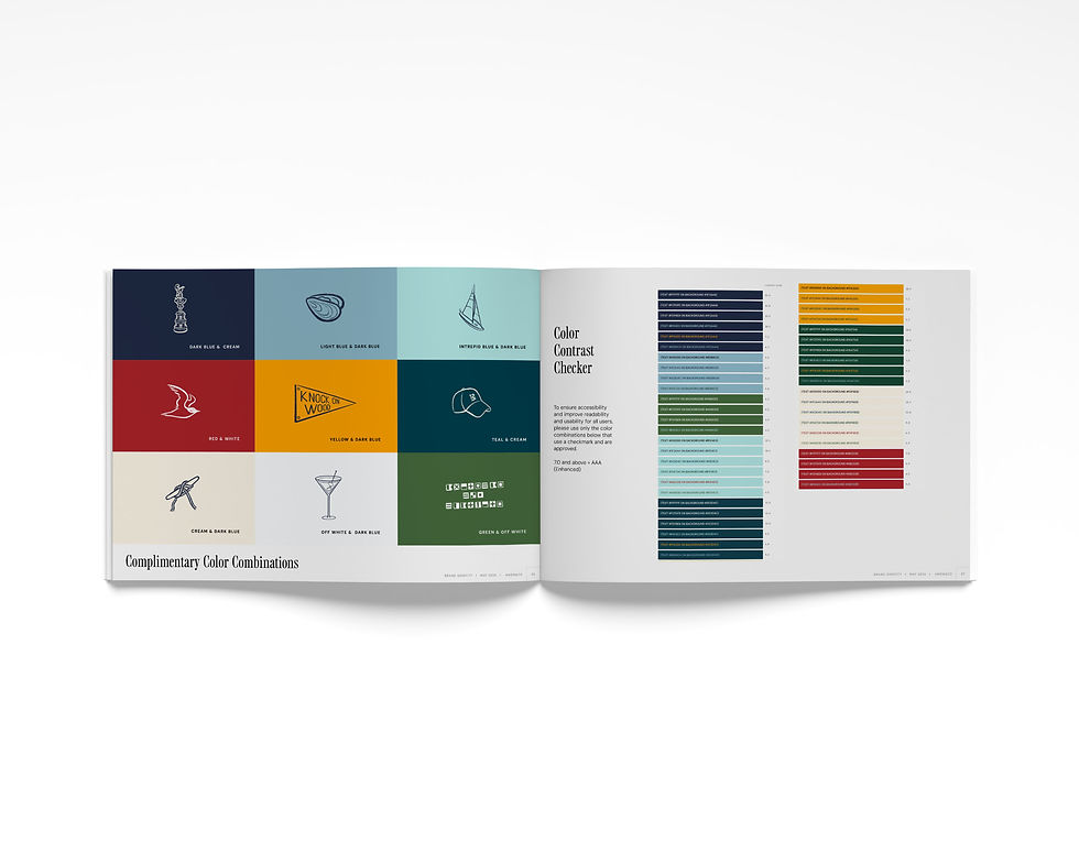
With these guidelines in hand, our clients can show up consistently, make the right impression, and ensure they never (ever) use the wrong shade of green!
Did you like learning about branding and how we make the magic happen?
Be sure to check out this post, all about another piece of a strong visual brand: fonts!


